R Tip of the Day
Circlize Package
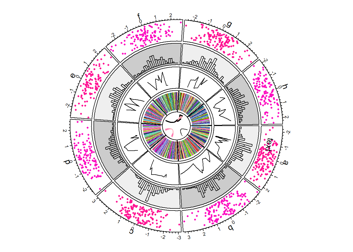
The circlize package is very helpful in displaying data circularly. This can allow us to stack different types of charts about the same data, as shown below, and it also has many benefits pertaining to looking at connections between variables.
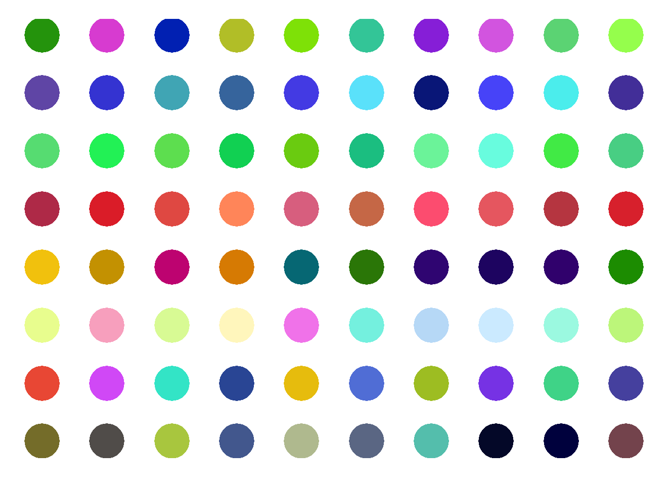
This next chart is just an example of how you can facet these charts. You can, of course, have multiple circles that all display data and charts, however for this example I choose to just play with their colors and brightness.
While the first two graphs were just playing around with the package with random variables, this last graph is a real world example of how the circlize package might be used. The World Phones dataset shows the amount of phones in different regions of the world throughout a few years. I am using it with the chordDiagram function to show where there were phones in the regions throughout the years.
# Load circlize package
library(circlize)

# Load WorldPhones dataset
data("WorldPhones")

# Create a circular plot
chordDiagram(WorldPhones, transparency = 0.5)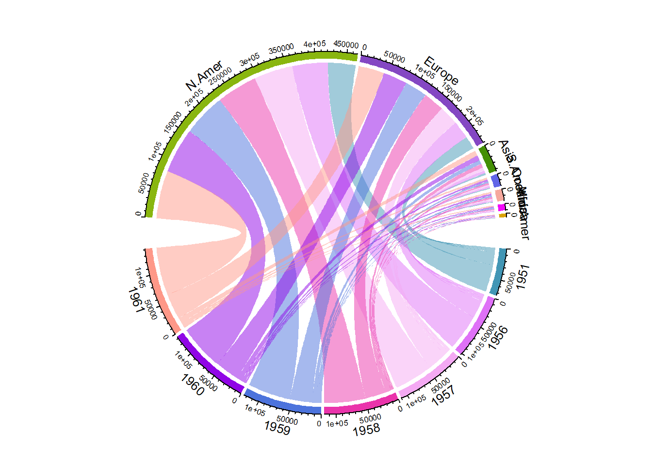
For more information, this link will take you to a presentation with an overview of the circlize dataset and some of its uses.